VISUAL IDENTITY
BRAND ASSETS
Royal Health Inc
HISTORY
2009: The Foundation
When Royal Solutions Group was established, our first logo introduced a unique circular design with the full company name integrated into the mark.
When Royal Solutions Group was established, our first logo introduced a unique circular design with the full company name integrated into the mark.
2022: Modern Evolution
After 13 years, we reimagined our logo to reflect a more contemporary aesthetic while preserving the iconic circular form that defined our brand.
2024: Royal Health Inc
Our current logo features a bold "R" at the center of the circle representing the word "Royal" and marking our evolution into Royal Health Inc.
Our current logo features a bold "R" at the center of the circle representing the word "Royal" and marking our evolution into Royal Health Inc.
2009

2022

2024

ELEMENTS OVERVIEW
Our visual identity is built on two core elements that define the Royal Health brand across all touchpoints.
LOGO
The Royal Health logo features a circular design with a centered "R", "Royal Health" at the top, and "Patient Driven Care" at the bottom. It uses Royal Blue and Bright Blue from our primary color palette.

Copied!
Copied!
ROYAL BLUE
#0F3A7D
Usage 80%HEX
#0F3A7D
Copied!
CMYK
100 88 23 8
Copied!
PANTONE
7687 C
Copied!
Copied!
Copied!
BRIGHT BLUE
#20acf7
Usage 80%HEX
#20acf7
Copied!
CMYK
64 14 0 0
Copied!
PANTONE
17-4563 TSX
Copied!
WORDMARK
The "Royal Health" wordmark is our registered trademark, filed with the United States Patent and Trademark Office (USPTO). It provides a clean, typographic representation of our brand for applications where the full logo may not be suitable.
Royal HealthTM
LOGO CONSTRUCTION
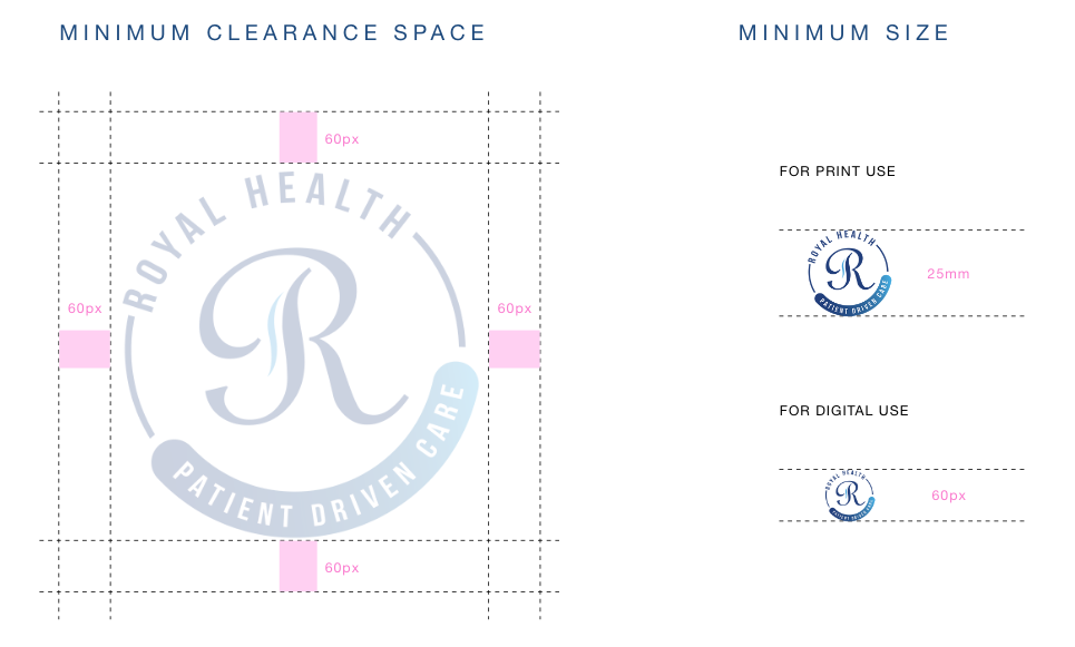
Proper logo construction ensures legibility and impact across all applications. This section defines the minimum clearance space around the logo and the minimum sizes for both print and digital use to maintain visual integrity and brand consistency.


