VISUAL IDENTITY
BRAND ASSETS
RoyalPay®
HISTORY
RoyalPay®
The RoyalPay logo was originally created in 2009 alongside the Royal Solutions Group brand family.
In 2022, the logo was reimagined with a modern aesthetic while maintaining its distinctive circular identity.
2009

2022

ELEMENTS OVERVIEW
The RoyalPay visual identity is built on two core elements that define the brand across all touchpoints.
LOGO
The RoyalPay logo features a circular design with a centered "R", "RoyalPay" at the top, and "Accelerate Revenue" at the bottom. It uses Royal Blue and Bright Blue from our primary color palette, along with Forest Green as a secondary color.

Copied!
Copied!
ROYAL BLUE
#0F3A7D
Usage 80%HEX
#0F3A7D
Copied!
CMYK
23 52 65 63
Copied!
PANTONE
7687 C
Copied!
Copied!
Copied!
ROYAL BLUE
#20acf7
Usage 80%HEX
#20acf7
Copied!
CMYK
64 14 0 0
Copied!
PANTONE
17-4563 TSX
Copied!
Copied!
Copied!
FOREST GREEN
#198942
Usage 20%HEX
#198942
Copied!
CMYK
85 20 100 10
Copied!
PANTONE
17-6153 TCX
Copied!
WORDMARK
The "RoyalPay" wordmark is our registered trademark, filed with the United States Patent and Trademark Office (USPTO). It provides a clean, typographic representation of the brand for applications where the full logo may not be suitable.
RoyalPay®
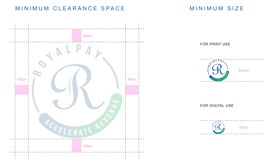
LOGO CONSTRUCTION
Proper logo construction ensures legibility and impact across all applications. This section defines the minimum clearance space around the logo and the minimum sizes for both print and digital use to maintain visual integrity and brand consistency.


